Well, I think the easiest thing is to ask... what didn't changed?
Our essence has not changed. It has not changed what is inside each of our candles and our diffusers, it has not changed our passion, and our commitment.
So why change? Change can be daunting, yes. Especially for a brand, with loyal customers, and who knows what they like, and don't like. But sometimes, it's what we need to achieve our goals, and take our place in the bigger picture of our segment.
We've been working on this rebranding since August 2021, with the aim of turning nidore 's image into something we know is our mission as a brand. And what is our mission? To create experiences, through our olfactory memory. To do this, we started to rely on abstract graphic designs, of what we think each candle transmits, and it's up to each person to decipher its message, and what it appeals to in their mind.
The logo
We wanted to make our logo simple, and text-based only, with no pictograms, or icons. Something that works for us everywhere.

We dropped the "Candle Studio" from both the logo and our name. Because well, we don't just make candles anymore, and we have a lot planned for this year.... And it's not just candles!
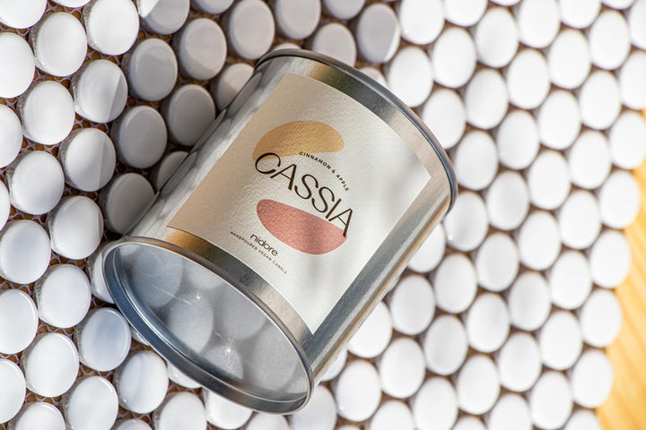
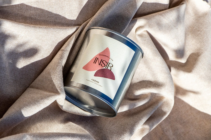
The graphic elements and the colour palette
We now have 7 graphic elements, and unlimited possibilities. Each one has its own meaning. Our natural coconut and rapeseed wax, our commitment to the environment, the relaxing feeling of having a lit candle , and the delicacy of our design.
They are used in our communications and on our product labels.

The core colours are colourful, yet delicate and pastel tones. They are our fixed colours, used for our communications with you, on our website, and everywhere else that needs a bit of colour.
The labels
With over 50 different labels that we have at the moment, this change was difficult. And being the main attraction of our products, and what is most present in your homes, we had to excel in this aspect.

So what did we do?
Firstly, the language. Our labels are now in English. So it allows us to do something we have wanted to do for some time: go all over Europe. And the language barrier of our labels did not help us in that mission. And now, we already have a shop in Germany! And others on the way, in France and Belgium. Nothing stops us! 😅
Secondly, the design. All the labels within the same essence have the same colours, and the same graphics. They are only adapted to the size of the product itself.
Thirdly, the labels on our Exilis range, which we believe may be controversial. We've done away with the label on the lid, and moved to having a label on the container itself. So it's easier to remove, and reuse the container. And it's now visible, while candle is lit! That's also a plus point.
Finally, the type of labels. Our labels (with the exception of our small candle labels) are now textured paper. This brings a premium feel that you should feel, when you buy one of our candles. The paper is still FSC certified.
The website
An image change was not complete without a new website. Simpler, cleaner, and minimalist. The changes are too many to list here, but let's get to some of the most important ones.
On the product page, we now have a section for each fragrance where we explain, using our own olfactory memories, what the experience of wearing that fragrance will be.
A clearer, more transparent ingredients and methods page, so you know exactly what you're buying. One thing that hasn't changed is our transparency. Neither have our materials!
Overall, a faster online shop, more functional, with fewer errors, and new features that are a great upgrade for us on the other side.
The unboxing experience
Being our first (and only!) contact with you, the experience you have when opening your order is one of the most important points for us.

Starting from the outside of your order. Personalised glue tape, 100% recyclable, which saves us from using more stickers. They are now only used to enclose the paper bag where our small candles are sent.
Our square boxes still guarantee maximum security, with double corrugated cardboard! You can jump on it, it won't break. And it is made with 50% recycled pulp, and is recyclable.

And inside, a thank you card, which continues to be handwritten by us. Because each order, and each client, is special to us. It is you who allow us to follow this dream, day after day.
The cards in the order, are now made of 100% recycled paper, and recyclable. With more concentrated information, to reduce the use of more paper.
Finally,
I hope you've enjoyed this (very) brief snapshot of what we've been doing, behind the scenes during these last 7 months, and I hope you'll continue on that side, to see us grow, thanks to you.
Lots of news for this year 2022, which starts with change. Because change can be scary, but it's also good!
Thank you!
- Mario